Project Overview
What is Sprout?
Sprout is a customer feedback platform to help retailers improve their customer experience by allowing shoppers to rate their interactions with store associates. Ultimately, this data will offer actionable insights that retail managers can leverage to better coach and train associates, improving their overall customer service strategy, sales and performance.
Timeframe
5 weeks
Team Members
Lola Akingbade, Layth Sihan, Justin Kim
My Role
Research, Wireframes and Hi-Fidelity designs
Tools
Sketch, InVision, and Adobe Illustrator

The Problem
The problem I tried to solve for was to: Design a manager administrative portal that allows the users:
To view employee performance and pinpoint areas of weaknesses
To measure store performance and revenue
To measure feedback

Users I identified
Wireframe exploration
Some explorations into the screens. I decided to redesign some of the wireframes for better user experience and to meet users’ goals
Re-created emotion statistics
Added employee photos
Some of the graphs had unclear titles
Metrics not labelled on the graphs


Preliminary Research
Competitive Analysis
We gathered information about the competition in order to define the basic features of our platform.

What we found
Most platforms used simple and clean interfaces for easy data visualization and consumption
Friendly yet professional tone
Included colored charts and graphs to deliver visual information
Liberal use of whitespace
Style Tiles
I created three style tiles communicate the visual essence of a brand. We validated our designs with some users. Most people preferred the Fun style tile as it was more appealing and seemed appropriate for a CRM.


User Interviews
We conducted user interviews by reaching out to people that fit our user personas. We sourced for people online and completed the interviews via zoom due to the pandemic in the country. The user interviews helped us to get an idea of what our users were looking for and to gather as much information from them as possible before moving forward. Throughout the 5 weeks, we conducted 3 rounds of user interviews for usability and desirability testing.
Store managers, Business owners, people in management roles or experience, sales associates or anyone in a customer facing role.
Solution
First Iteration
User Insights From Testing
We tested our screens with users from our target audience to discover what they thought about the product so far.
What worked
Users liked that they did not have to scroll for long to see important information
Use of employee photos made it look more personal
Liked toggle option to filter through dates etc rather than having a lot of information on a single page.
What did not work
Inconsistent CTA and logo color use.
Would have loved more use of brand colors in UI
Screens were too busy
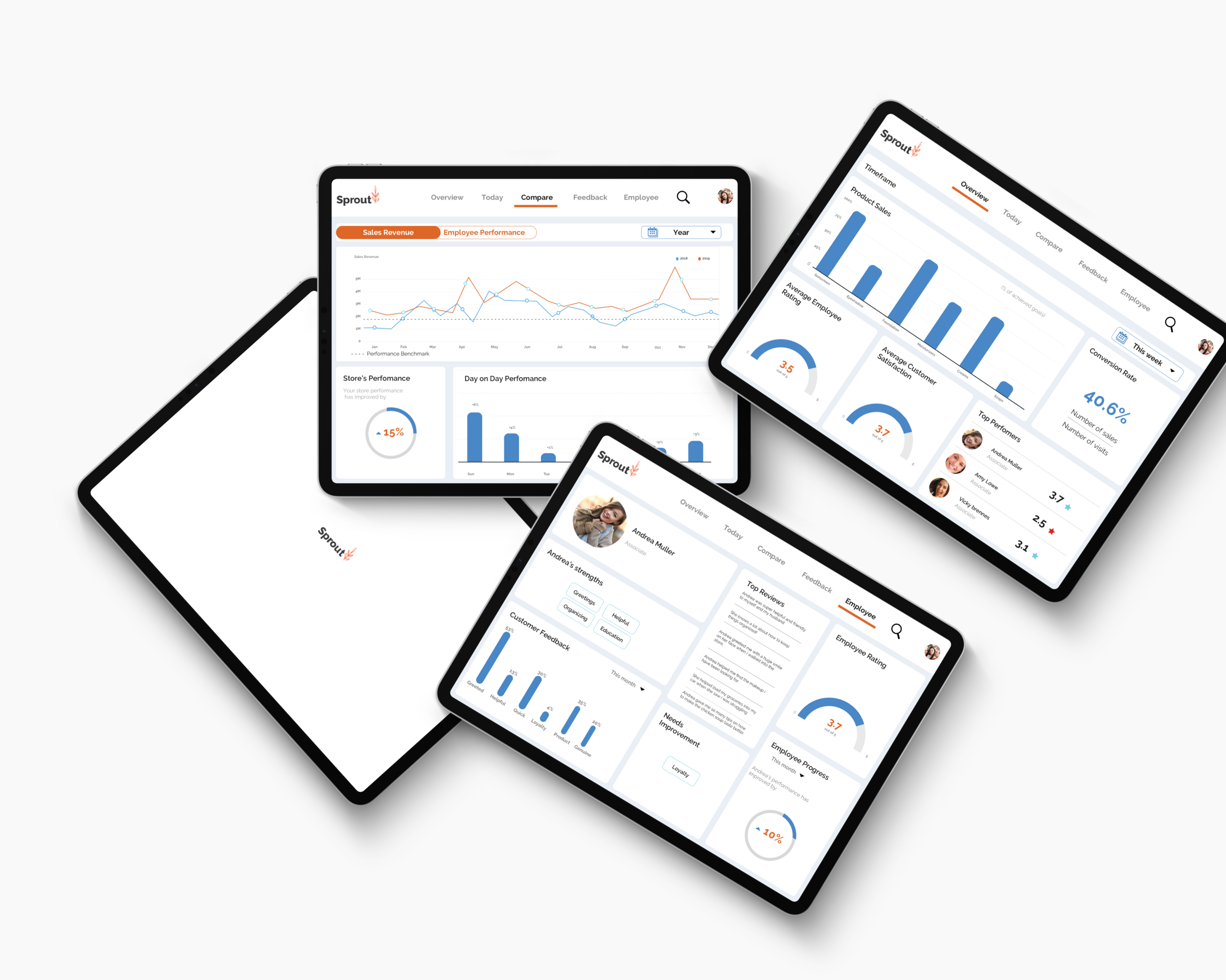
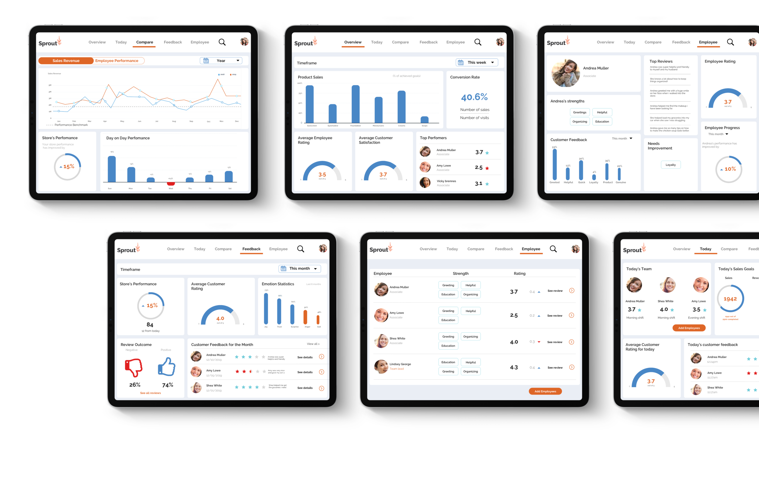
Final Iteration and Breakdown of Each Screen
After testing out the high-fidelity screens and getting user testing, I made changes to my designs based on the feedback we received. Each page is broken down below to explain my design decisions.
Measuring store revenue and Employee rating
This is how Sprout solves for measuring store revenue and employee performance.
User is able to view product sales over different time periods
User can view average employee rating for that time period
What I could have done better
The use of the red color may not be accessible to color blind people. Next time, I could make use of icons like thumbs up and thumbs down to make it accessible to all.
Measure feedback and Store performance
This is how Sprout solves for measuring real time feedback from the customers:
The thumbs up and thumbs down to show negative and positive outcomes.
Customer feedback for the month with details
Emotion statistics to show customer opinions
Average customer rating
Store’s performance
Employee performance and Pinpoint weakness
This is how Sprout solves for measuring employee performance and pinpointing weakness:
Users are able to see individual ratings and target who may need additional trainings.
User can see information on specific employees such as reviews, progress and areas of weaknesses in order to provide necessary trainings.
What I could have done better
Move the “Add employees” button at the bottom to the top


How successful were our designs to users?
We carried out a final usability test to measure success by checking behavioral metrics of user experience, such as how long it takes to complete tasks by having them walk us through certain tasks, percent of tasks completed and error rate.
Tested 5 users: All were able to complete tasks given to them within a few seconds.
High Fidelity Screens
Prototype Video

Reflections
Successes
I was able to meet the goals and needs of our user personas which were the following:
Measure store performance and revenue
Actionable way to get feedback
Glanceable way to measure employee performance and pinpoint weakness.
Limitations and Constraints
Plan back-ups when it comes to user testings and cancellations.
We were unable to customize the dashboard for specific sectors. Different industries have different metrics that they find valuable.
Mobile version may not be user friendly for this type of platform.
Future Recommendations
It may also be great to create a way for the employees to access their profile to view the customer feedbacks about themselves.
User interview for initial wireframe explorations.