BUSINESS CASE
What is Edward Consulting?
Edward Consulting prioritizes improving lives through education by connecting people to the best universities and scholarships in the world
Timeframe
5 weeks
Team Members
Lola Akingbade, Bimpe Femi-Oyewo, Developer
Tools
Sketch, InVision, and Adobe Illustrator
My Role
UX/UI Freelancer, focused on redesigning the website to create a more professional feel.

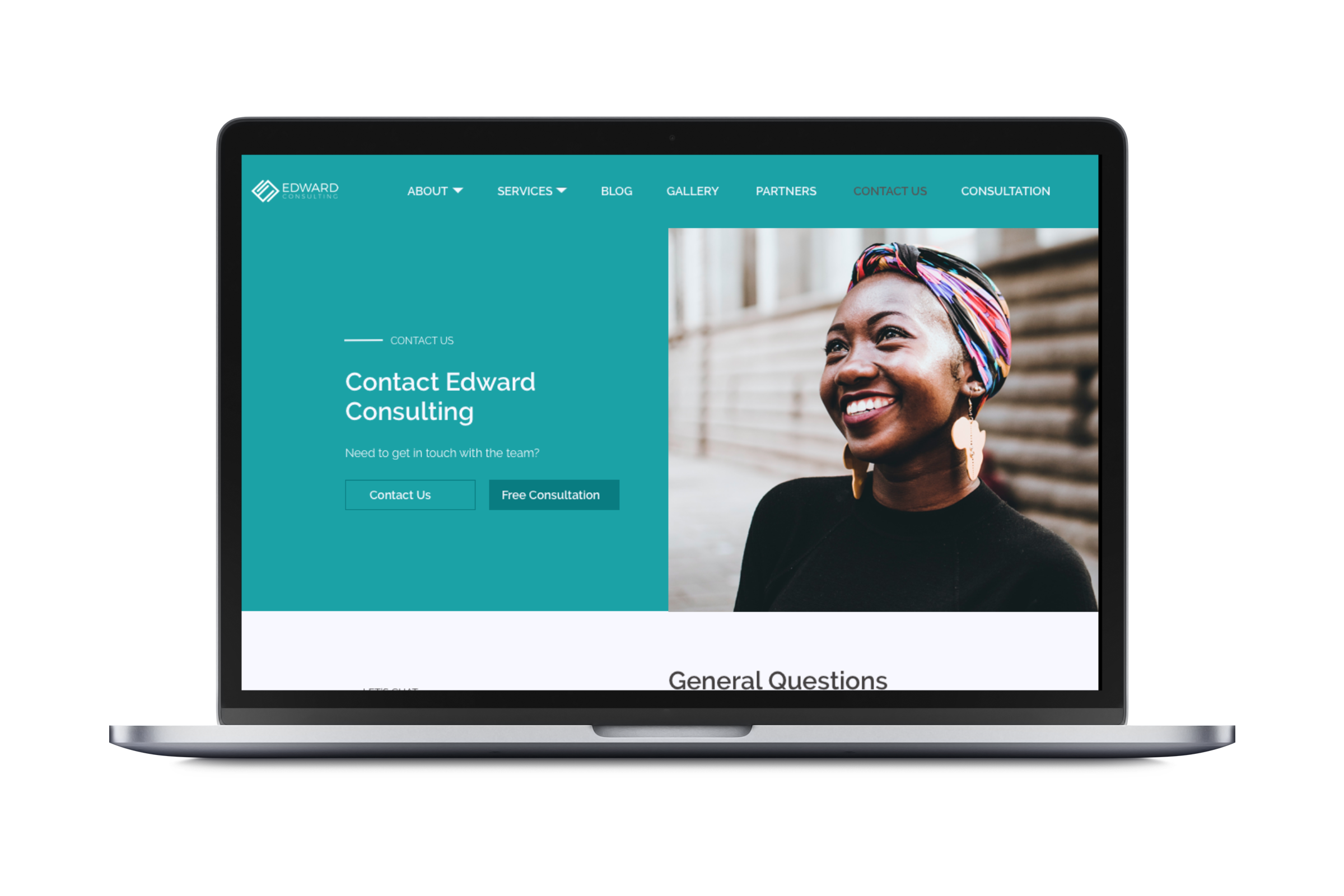
The Problem
Have more people visit the website, free consultation page and sign up for the newsletter.
How can we create a platform where users can easily search the website to find resources on what applies to them?

Our target users
Preliminary Research
User Interviews
I conducted user interviews by reaching out to people that fit our user personas. Time and budget were limited and I wanted to ensure I got the right users to ensure they represented the individuals that will typically use the website. I reached out to some friends that knew people looking to study in colleges abroad and scheduled sessions with them. I also reached out to teachers of students preparing to go into college or were enrolled in college preparatory schools to have their students test the current platform.
For these interviews, the audience was broad and spanned both genders in order to represent the individuals who would use the platform.
Sketching & Wireframes
In coming up with the solution, I began my process by making a few sketches on paper, then created wireframes from them in order to see if my users were able to complete basic processes. My goal was to understand and simplify the process of various pages for users.
I focused on wireframe iterations in order to avoid wasting time creating features and functions that users did not need at the moment.
What users thought
Users felt the form for free consultation contained too many questions
Users wanted the navigation bar to highlight the page they were currently on.
Solution for users
First Iteration
Based on the feedback from users with the wireframes, I created modified versions. I then proceeded to hi-fidelity by adding color and images in order to represent the branding of the platform.
Old vs New Homepage
With the original homepage subscription, users sometimes forgot what they were meant to input in the fields. The menu bar was also at the bottom of this image and disappeared as they scrolled down.
I designed the new Home Page to solve Jane’s frustration with not remembering what to put in the text field for subscription. This way she does not have to keep clicking out to see what it was asking.
The menu is at the top and is sticky so follows as they scroll the page.
Old vs New Gallery page
The initial gallery had users wondering what pictures they were looking at and why.
I designed the gallery page to have folders for events that had several pictures to display and also sections for independent pictures.
The individual pictures with information on each one when the user hovers over it.
Old vs New Blog page
Users did not particularly like the original blog page layout and felt it could be better displayed for more usability.
The new blog page I designed showed posts in categories with icons representing each category. It also has a top slider for top posts or important blog posts to be displayed.
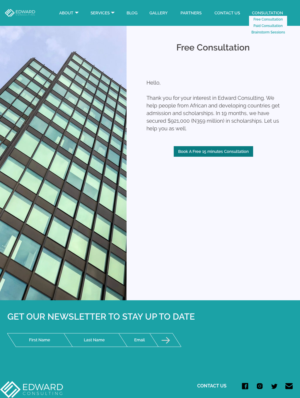
Free consultation form
Users complained that there were too many questions on the free consultation questionnaire.
Set up Calendly for appointments
Re-branding the website
The client wanted a brand identity that was clean and professional and would allow its users know it was a professional platform and that they could be depended upon to help solve their needs for education.

How successful were our designs to users?
I carried out a final usability test to measure success by checking behavioral metrics of user experience, such as how long it takes to complete tasks by having them walk us through certain tasks, percent of tasks completed and error rate.
Users were more likely to book free consultation
Client could already tell she will save some time with the new free consultation format and appointment process
Users were better able to find resources they wanted on the platform