

Published -
August 7, 2025
Tasks include: Designing user interfaces, Creating design framework, Reducing component sizes, Collaborating with PMs and Engineers.
Tools used: Figma
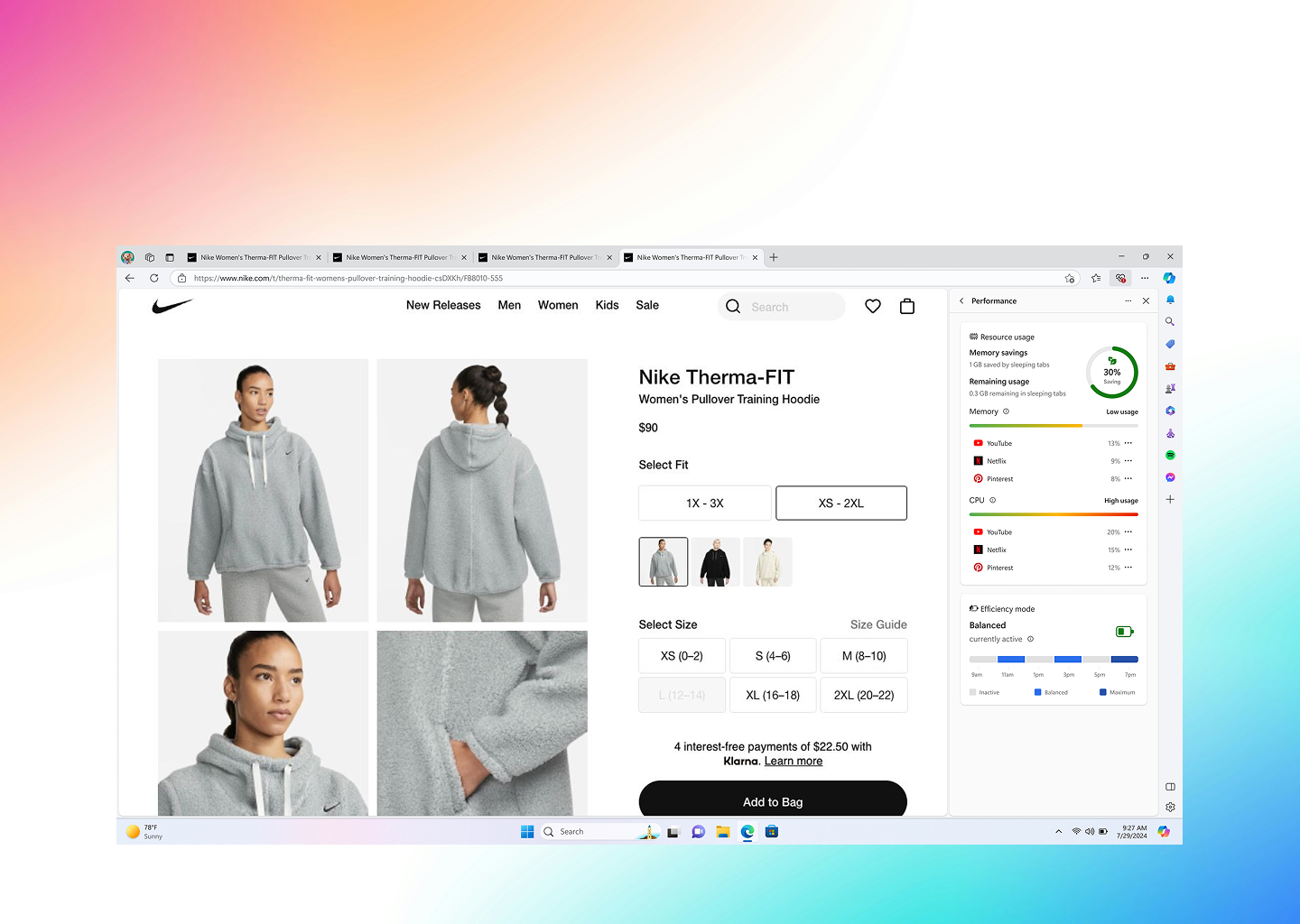
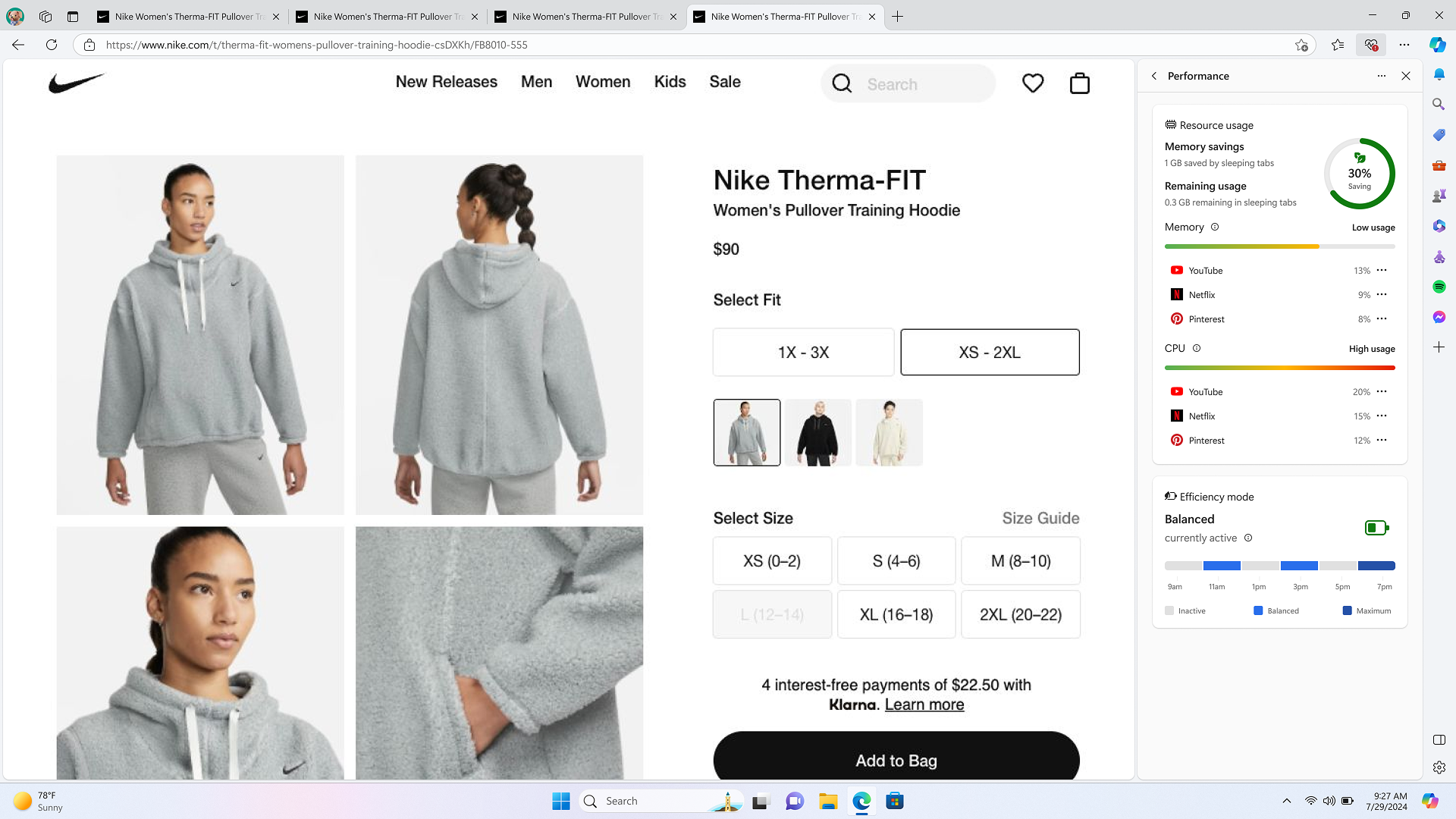
Browser essentials help users gain additional insights about the healthof their browser. It shows up on the right side pane of the Microsoft Edge browser.
Browser essentials is already on and will provide notifications whenattention is required.
Users can access additional information about the performance and securityof your browser by selecting the heart icon in the browser toolbar or byclicking the 3-dot icon at the top right corner of the browser and thenscrolling down to “Browser Essentials”.
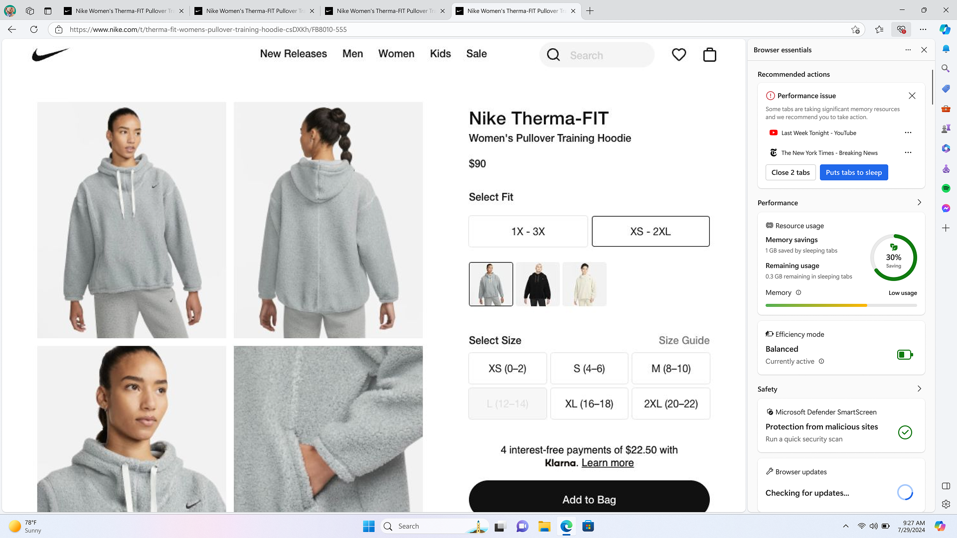
It will notify users when their attention is required towards theirbrowser’s performance or security and offer recommendations that can helpimprove the performance and security of their browser.
The bundle size keeps increasing and there is a lack of space as each new feature that gets added adds complexity, more decisions, more special cases to the flat view
There is no consistency or reusability of web-components. Each team creates their own web-components and thus no common design pattern among the components.
Current display does not provide enough details for users to engage with.
The customer needs
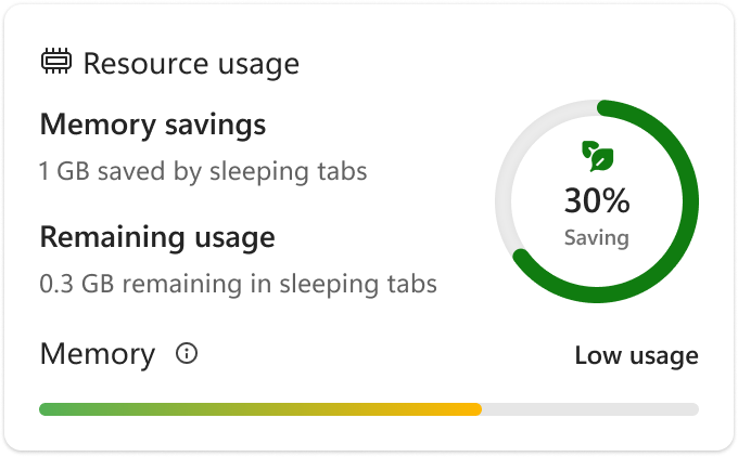
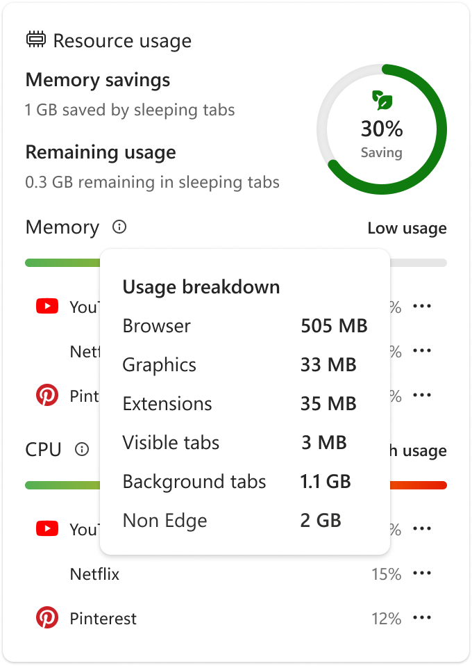
Customers would like more details suchas the graphs and charts presented, details about leaked and weak passwords totake the necessary measures.
Create a UI toolkit that creates coherence and systemization of controls,provides a consistent look and feel for the UI and continuity of designs andoptimize the bundle size.
Provide our users with more details.
We will measure success by looking at metrics such as:
I worked on some principles that could be applied across all teams in avariety of cards in Browser Essentials to ensure coherence and consistency forall teams and features added.
I worked with a team of engineers and 3 design PMs, we did twice a weekdesign sprints and meetings where, in each meeting, we discussed design feedback and had weekly design updates.
Designs were done in four (4) weeks with continued support given toengineering after design handoff.
I worked on some principles that could be applied across all teams in avariety of cards in Browser Essentials to ensure coherence and consistency forall teams and features added.
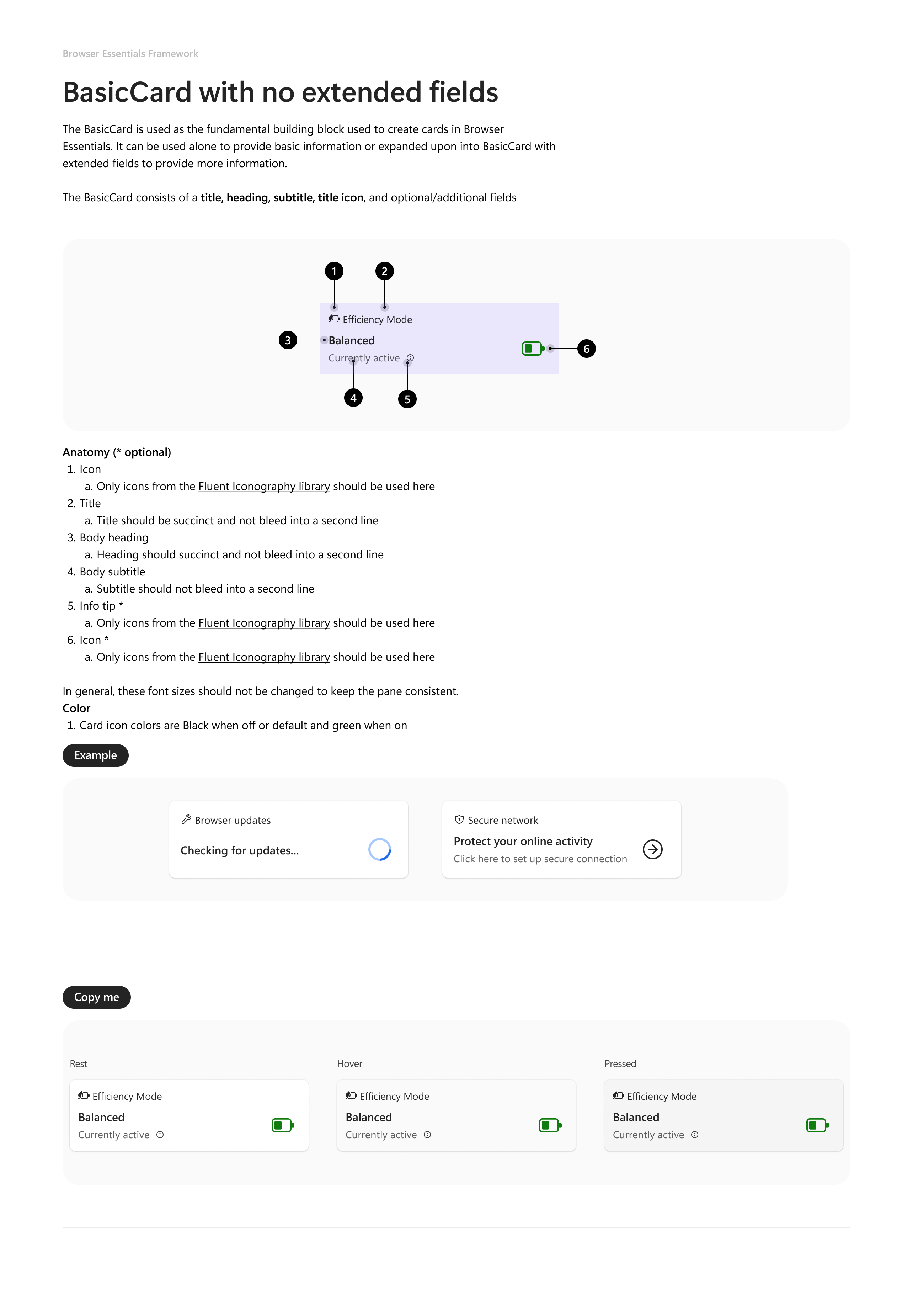
.png)
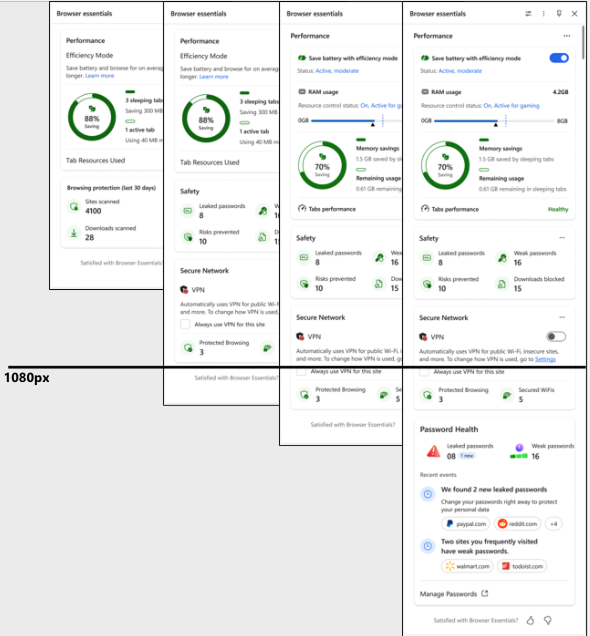
After redesign
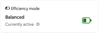
After: Initial layer for Efficiency mode card
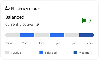
After: Second layer for the Efficiency mode card with expanded viewshowing more data on activity
After: Second layer for the Efficiency mode card with expanded viewshowing more data on activity with hover card
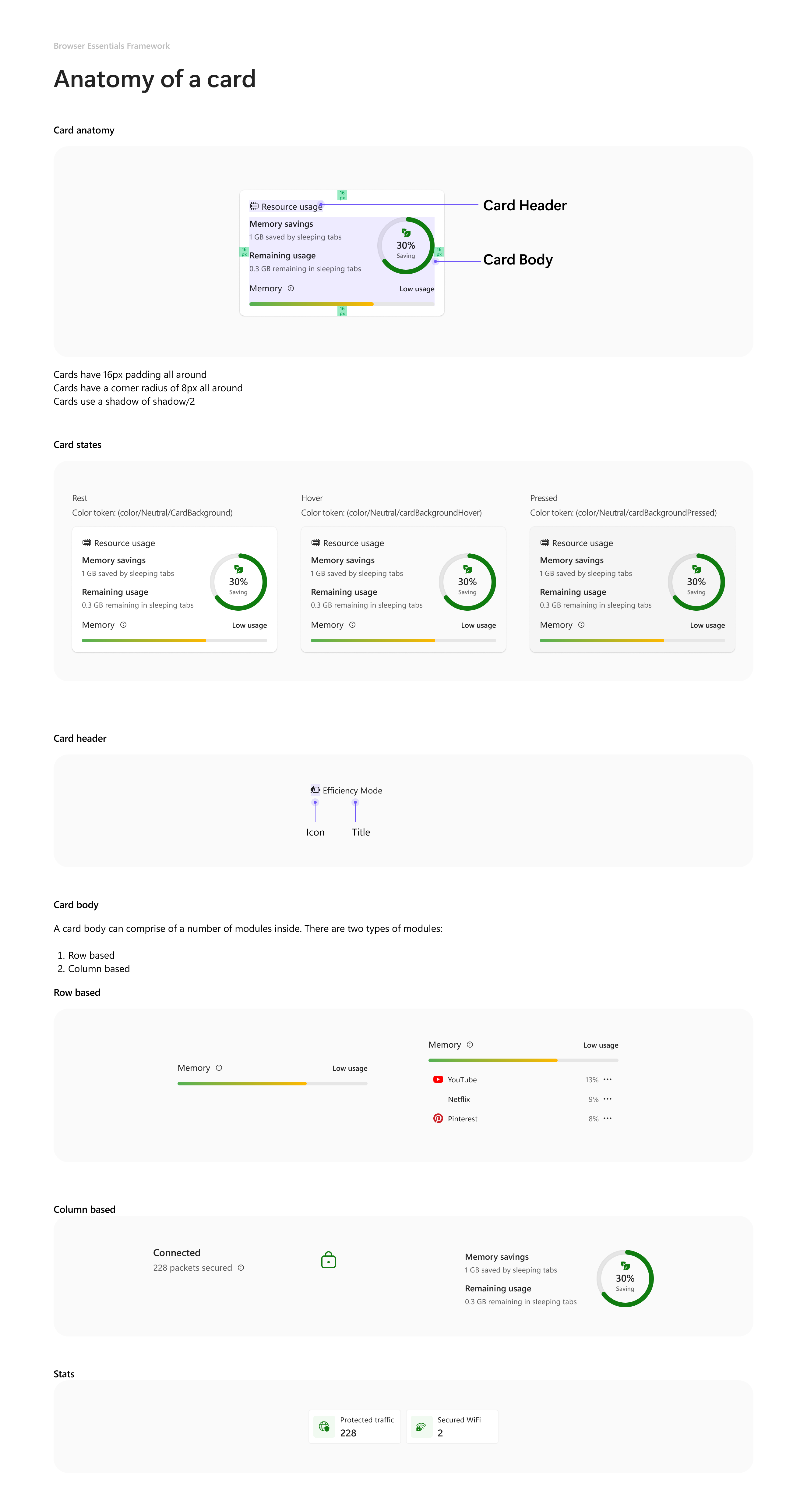
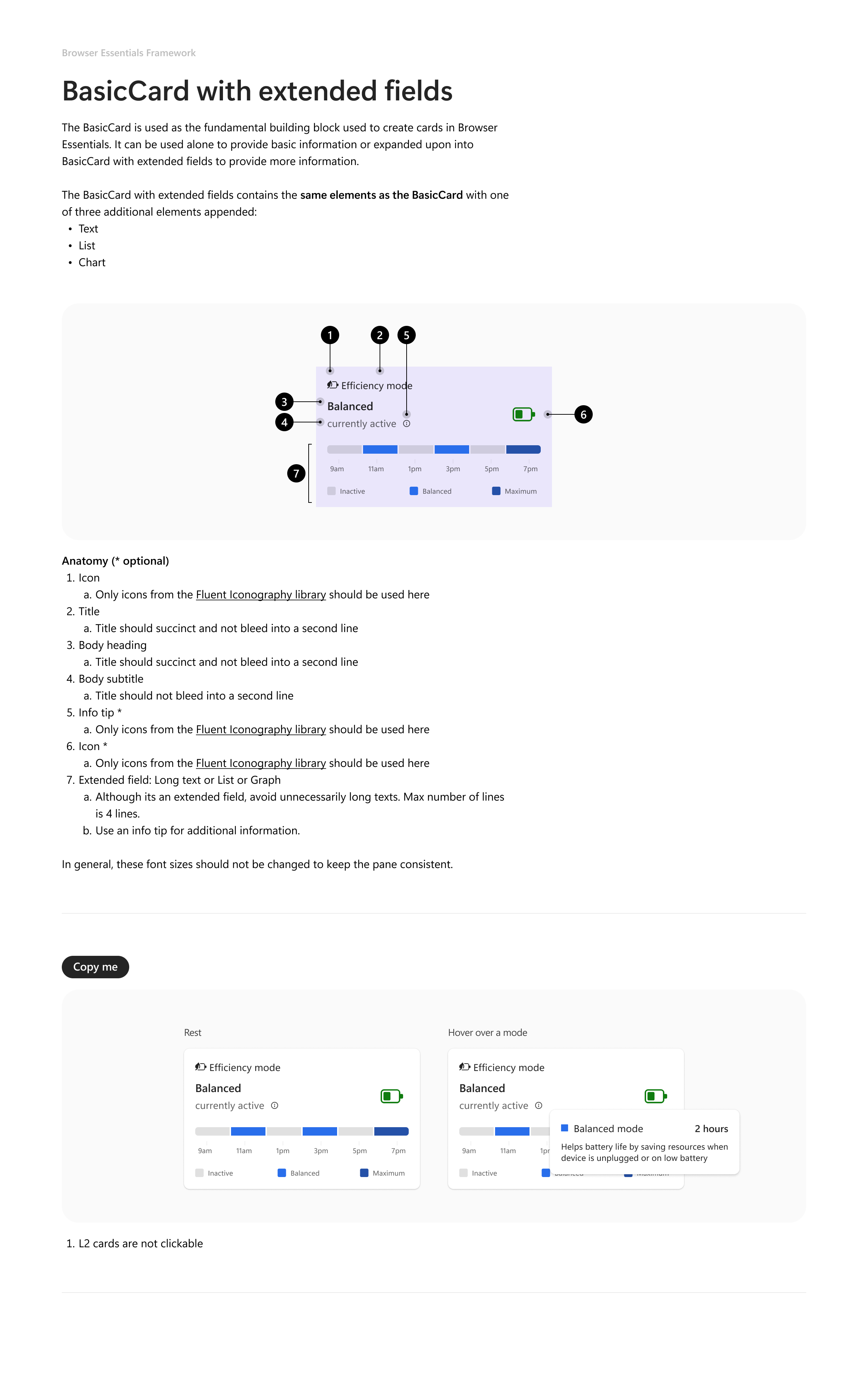
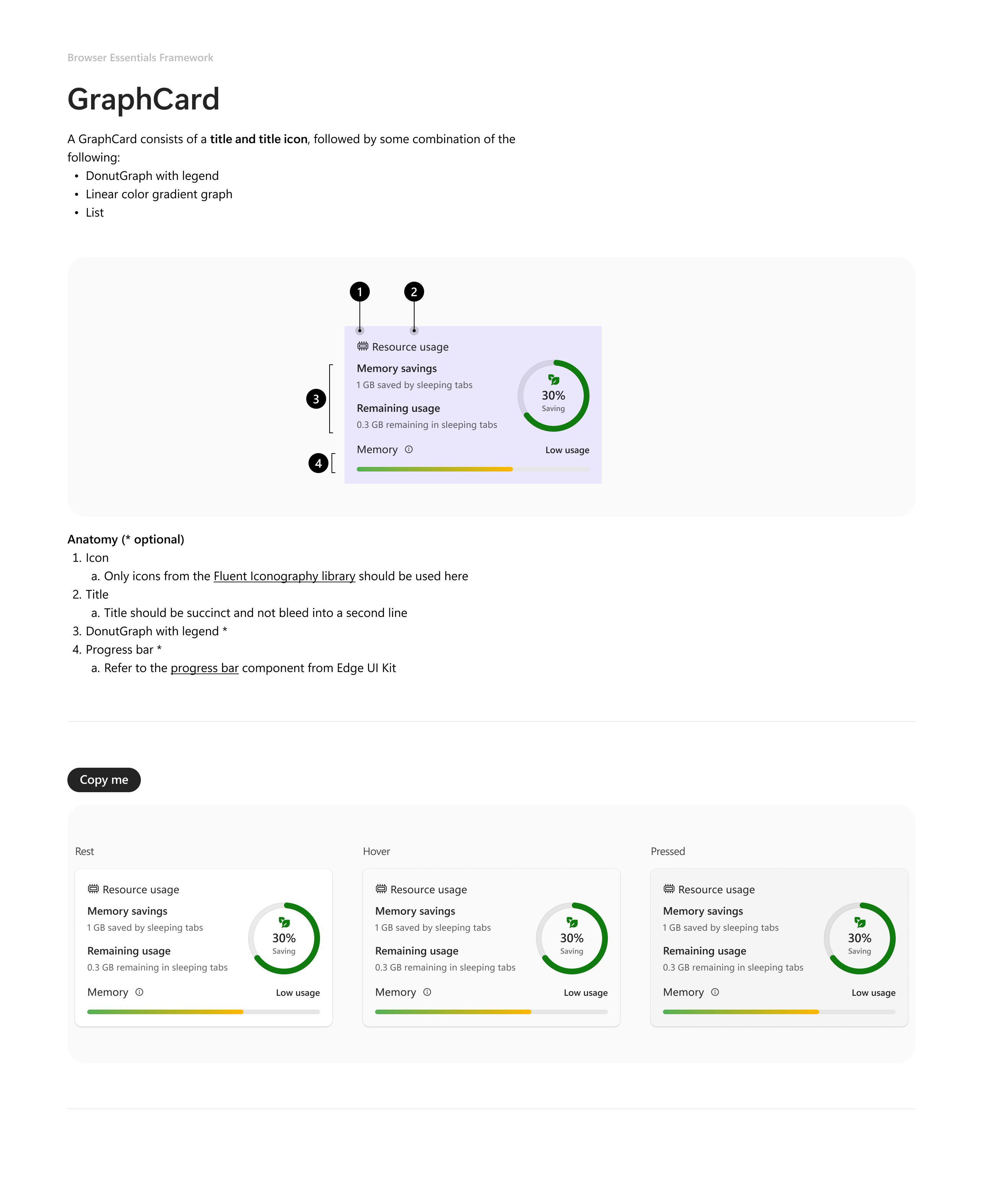
This section shows the anatomy of the cards and design systemprinciples guiding their layout.
.png)
With the refresh, we have also been able to optimize the size of thepane by using smaller card components and showing only essentialinformation while providing an opportunity for users to click the cards to gointo the L2 to see more details.
Understanding the business and impact: I learned that although designs are important, but itis also important to understand the business goal and impact. This helped me tocreate more informed design decisions that truly aligned with the overall goalsof the project and company.
Transparent management of tasks: With working with different partners, and constantlyshifting priorities, it is important to have a unified task list or loopdocument that is accessible to everyone working on the project. This helps keepeveryone on track and on the same page when it comes to what needs to be done,timelines etc.
Communication: Working with a team of PMs and Devs meant ensuring everyone wasconstantly aligned on the progress, tasks and timelines. It was therefore importantto have weekly syncs to keep everyone on the same page and discuss concerns,questions and get feedback throughout the process.
%20(1).svg)